BikeStation
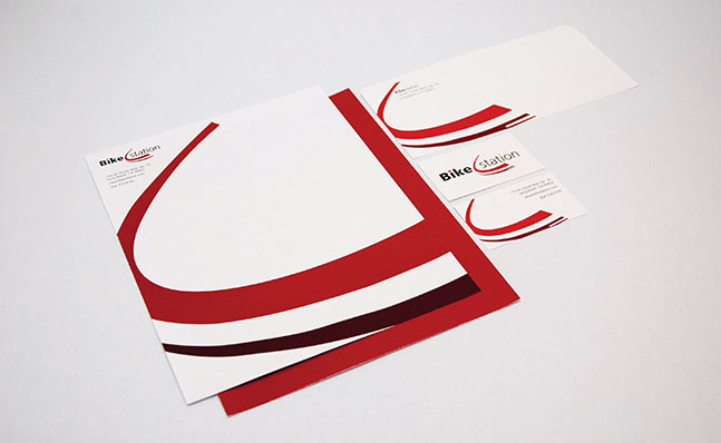
The concept for this logo came from the manipulation of different objects that come from or that are related to bikes. The “swoosh” in the middle of the logo represents a bike wheel that is in movement. This relates to the company because they are all about getting people out and using a bike for transportation. The use of a sans-serif typeface for the type combined with the graphic illustration gives a contemporary feeling to the company.
Rebranding